Showing posts with label Moxie Fab. Show all posts

Saturday, October 19, 2013

Apache Tears - Tuesday Trigger

Hello friends! The deadline for the current Tuesday Trigger over in the Moxie Fab World is fast approaching so I want to share this card before it passes. I tend to take my inspiration literally (perhaps too much so at times) but in this case it was almost impossible not to be inspired by both the brilliant, rich combination of colors and the the arrow/chevron pattern in the trigger image.


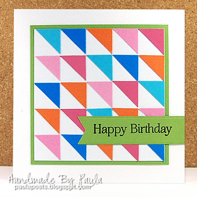
This is probably more ink colors than I've used on one card all year and it took a few tries to stamp the pattern one chevron at a time and alas it's still not perfect but I couldn't cope with another try. LOL  After trying quite a few shades of ink I wound up using, Orange Fizz, Berrylicious, Steel Blue and Razzle Berry from MFT. Canary Yellow Pigment ink from Color box and an old favorite from Stampin Up, Bravo Burgundy. The chevron stamp is from the Ikat Additions stamp set and the sentiment is from Modern Leaves, both by Avery Elle.

Despite the hot pink in this I think it could fall into the 'masculine' category and work for the guys. What do you think?

Happy Crafting!
signature


Saturday, September 28, 2013

All The Glitters is Gold in the Moxie Fab World

“All that glitters is not gold; 
Often have you heard that told..."
William Shakespeare, The Merchant of Venice

Well, Shakespeare could be right but not when it comes to the current "All That Glitters is Gold" challenge at the Moxie Fab World blog. The vast majority of my cards go to Operation Write Home and because of the danger it can pose to our military heroes, using glitter and/or anything that might flake off and attach itself to clothing is against the OWH guidelines. I was tempted to just make a non-OWH card and dig out some gold glitter but I came across a gorgeous scrap of ribbon and decided I'd go this route instead.


Photographing metallic elements is so difficult! This a close up that helps show it a bit better. The sentiment is heat embossed in gold.


Like most of you I have a lot of crafting supplies and among them are some metallic embossing powders and some brads, but this challenge made me realize that when it comes to metallic stuff I don't really have all that much, so a little selective shopping may be on my agenda soon. 

Happy Crafting!
signature

P.S. The bit of Shakespeare at the top of my post is misquoted as shown. It really should say 'glisters' instead of glitters. It is commonly mis-quoted and I'm hoping The Bard and any English teacher who reads this finds it in their hearts to forgive me. :)


SUPPLIES USED: 
STAMPS: Sentiments (Stampin Up- Retired)
INKS: Versamark & Gold Embossing Powder
PAPER: French Country (Graphics 45), Recollections Solids (Michael's)
DIES/PUNCHES: Large Ovals (Spellbinders) 
OTHER: Ribbon from my Scrap Bag & Gold Brads 
BASICS: Click HERE to check out my crafting tool bag.

Saturday, September 21, 2013

In Transition - Moxie Fab Tuesday Trigger

I'm playing along again with one of my very favorite challenges, the Moxie Fab World Tuesday Trigger. I always start out by asking myself what I see or think of when I look at the trigger image. This image is colorful, techy and it has movement to it... almost as though it's vibrating. Here's my attempt at wrapping all that into a card design.


Trigger Image Credit
When I initially began cutting my thin strips I thought they should all be identical but as I began to glue them down in to a pattern I decided that perfectly matched pieces would take away the feeling of movement and create a much more static pattern so I abandoned the idea and just let myself be guided by instinct instead.

This was a challenging trigger for me and yet interestingly enough I can see several possible approaches and I might even do another if time allows.

Happy Crafting!

signature

SUPPLIES USED:
STAMPS: Sentiment by Stampin Up 
PAPERS: Recollections Soldis (Michael's)
INK: Steel Blue (My Favorite Things)
OTHER; Silver Brads

Saturday, September 7, 2013

Moxie Fab Honors Ombre with the Tuesday Trigger

The current Moxie Fab Tuesday Trigger Challenge is all about Ombre. Though I don't think to use it in my designs often, it seems that Ombre is still pretty hot and trendy and not just in the crafting world. Ombre is defined as 'Having colors or tones that blend  into each other —used especially for fabrics in which the color is graduated from light to dark'. (A side note to all my Bootcamp Enlistees who are reading — where color schemes are concerned it will fall into either the Monochrome or Analogous categories because to achieve an Ombre effect you're going to use tints, tones and/or shades of one hue or hues next to each other on the color wheel we studied in the ABC's of Color ).


Isn't this Trigger image just beautiful? I used the Marth Stewart Garden Trellis Deep Edger Punch to create my layers, lining each with a thin piece of white computer paper behind the open work to keep them visually separated. The butterflies are the Beautiful Wings Stampin Up/Sizzix Embosslits and the sentiment is from the Hero Arts, Remember Your Kindness set. Something about this card makes me feel it's somewhat 'Victorian' in style. Certainly the typestyles used in the stamp set are partly responsible but also the shades of  purples and pinks, as well as lattice, gardens and butterflies.

Happy Crafting!
signature


SUPPLIES USED: 
STAMPS:Remember Your Kindness (Hero Arts)
INKS: Steel Blue (My Favorite Things)
PAPER: Recollections & Bazzill Solids  (Michael's)
DIES/PUNCHES: Garden Trellis Deep Edge Punch (Martha Stewart), Beautiful WIngs Embosslits (Stampin Up/Sizzix)
OTHER: Rhinestones (Michael's)
BASICS: Click HERE to check out my crafting tool bag.


Sunday, August 25, 2013

Hello There

I've created this card for the Trigger Tuesday - Now That's My Cup of Tea challenge over at the Moxie Fab blog. I opted to go with the colors and flowers as my inspiration. With the exception of the red flower these are all die cuts, including the sentiment, from the Silhouette store. I drew the thin red one by hand in Adobe Illustrator and turned it into a cut file for my Cameo.


Several things that stood out to me when I saw this trigger image including the robin's egg blue saucer color, the transparent quality to the green flower where the petals overlap each other, the asymmetrical, scattered pattern of the flowers and the variety in terms of the shapes and styles of the flowers. 


I used white cardstock for all my pieces (except the embossed panel in blue) and then used my markers to color them. Though most people think of markers in terms of coloring images they can really be used for so much more. Using them to create a customized color palette is something I do often. It's easy to do and since I own a large collection it almost always guarantees that I can get the color I want even if my cardstock selection is limited.

Happy Crafting!
signature


SUPPLIES USED: 
PAPER: Recollections Solids (Michael's), Accent 65# White Cover
DIES: Flowers & Sentiment (Silhouette Store)
COLORING MEDIUM: Prismacolor Markers
OTHER: Swiss Dot Embossing Folder (Cuttlebug), Acrylic Dots (Michael's)
BASICS: Click HERE to check out my crafting tool bag.

Monday, August 19, 2013

Trendy Triangles and Color Throwdown #255

This card was created for the Moxie Fab Trendy Triangles challenge. I opted to go with a square design and made it a birthday card since I need to send one out this coming week. Believe it or not I don't send many cards and I  typically don't make the few I do send, so it's not at all unusual to find me at a local Hallmark or in the greeting card section at Walmart. In the past week though I've made two for upcoming occasions so maybe I'm starting a new trend. :)


I used a 3/4" square punch and then cut them from corner to corner. I  lightly penciled some guidelines on a 3.75" square base and then glued down each piece. Gluing down such small pieces was not easy, so they are not precise, but they're close enough to create the effect I was aiming for. The color palette is taken from this week's Color Throwdown challenge, and while it's not one I would have come up with on my own I like the way they look together and they make a nice choice for a festive, fun occasion like a birthday card.

So not only did I manage to enter two challenges, I have a card all set to mail out. Well, all set except for an envelope which I'll probably have to make by hand too since I'm not likely to find a single square envelope easily. 

Happy Crafting!
signature

SUPPLIES USED: 
STAMPS: Year Round Sentiments (Hero Arts)
INKS:  Black Onyx (Versafine)
PAPER: Recollections Solids (Michael's) & Bazzill Basics
DIES: Fishtail Flag Stax (My Favorite Things)
OTHER: 3/4" Square Punch (EK Success)
BASICS: Click HERE to check out my crafting tool bag.

Sunday, August 18, 2013

Craving Navy

Navy blue invariably makes me think of the all things nautical... the seashore, lighthouses and a crisp U.S. Coast Guard or Navy uniform. I dipped into my collection of lighthouse stamps and created this card to join in on this week's Moxie Fab World - Tuesday Trigger.


This stamp, which is quite old (it might be from PSX but I am not sure) depicts the New London lighthouse. New London is a seaport city in southeastern Connecticut and home to the U.S. Coast Guard Academy. Founded in 1876 the USCGA is the smallest of the federal service academies. New London is also one of the very early towns settled in the state. Because of it's deep water harbor it became a base for naval operations during the Revolutionary War.

Happy Crafting!
signature


SUPPLIES USED: 
INKS: Majestic Blue (Versafine), Navy Blue Chalk Ink/Distressing (Color Box)
PAPER: Recollections Solids (Michael's), Blue Plaid (Studio G), Summer Splash - Woodgrain (My Minds Eye)
OTHER: Argyle Embossing Folder (Cuttlebug), Mini Brads (Oriental Trading), Gardener's Twine, White Signo Gel Pen 
BASICS: Click HERE to check out my crafting tool bag.

Sunday, August 11, 2013

Artist's Party Favor Ensemble

I hope you've all had a good weekend. As it turns out I did get a chance to do some crafting today and among the things I worked on was this party ensemble. It's not something I would normally do but it's one of the Moxie Fab Birthday Creations Week challenges and I like throwing something into the mix once in awhile that isn't a card. It helps stretch your creative muscles.


As a kid I could never get enough of art supplies, so this would have been a perfect party favor for any of my parties. The crayons were created on my Silhouette Cameo as were the letters for the personalized 'belly band' around the small notebook. I personalized the tag and thank you card with a white gel pen which I think makes this party favor set special and it's easy because you can make the pieces ahead and personalize them afterwards. The thank you card could easily be translated into an invite by a simple sentiment swap. I know we live in a high-tech age but I sure do hope that the art of writing Thank You notes is still being taught to kids. This idea could easily be adapted for older girls too by  swapping crayons for markers or maybe those cool glittery gel pens. 

This was a fun project to play with and I'm going to color in the notebook and keep it in my purse. Oh and in case you're wondering you're never tool old for crayons. I did a piece as a high school senior for my Parson's admissions portfolio in Crayola® Crayons and it was one of the most well received in the whole lot.

Happy Crafting!
signature

P.S. By the way, please note that while it's not going to be a problem for your personal use you must be mindful when it comes to using logos, images and icons in your crafts. a They're copyrighted by their respective owners and you could have a major legal issue if you're selling anything made with them or probably even publishing them for that matter.

SUPPLIES USED: 
STAMPS: Sentiment (Stampin Up - Retired), Notebook Cover Daisy Coloring Page (Dover)
INKS: Onyx Black (Versafine)
PAPER:Recollections Solids (Michael's)
DIES: School Paint Palette & Crayons Die (Silhouette)
OTHER: White Yarn, Signo Gel Pen
BASICS: Click HERE to check out my crafting tool bag.

Friday, August 9, 2013

Moxie Fab - Birthday Sketch Challenge

I don't ordinarily use sketches very much but the past couple of weeks I've come across a few that I decided to give a whirl and they can be a great starting point if you decide to creatively venture off in your own direction with them or used as a very straightforward recipe when you follow them closely.  I made this card using the sketch from the Moxie Fab World - Birthday Sketch Challenge.


I designed it a vertical format (as shown in the sketch) but it could definitely be turned on it's side and work perfectly too. I'm actually not sure which format I like best. The sketch challenge is just one of five that are part of the Birthday Creations Week  and you have until Monday (August 12th) to join in on the fun.

Opps! I realized after the fact that in addition to using the sketch the parameters of the challenge were to do it using all stamping or no stamping. I could have stamped my flowers instead of using these leftover die-cuts I had on my table. Oh well. I do still really like the sketch. :)

Happy Crafting!
signature


SUPPLIES USED: 
STAMPS: Birthday Sentiments (My Favorite Things)
INKS: Gumdrop Green, Black Licorice (My Favorite Things)
PAPER: Solids (Bazzill), Grid Print - Grade School Stack (DCWV)
DIES: Layered Rose (My Favorite Things)
OTHER: Green Brads
BASICS: Click HERE to check out my crafting tool bag.

Thursday, August 8, 2013

It's Completely Collagical - Tuesday Trigger

My card share today was made for the current Tuesday Trigger at the Moxie Fab World blog. There is so much to be discovered in the trigger image that it really takes a little studying. When I looked it here's what stood out to me: stamps, butterflies, buttons, flowers, blue, pinks, tan and ivory. I knew I wanted to make postage stamps a major part of my design and I also wanted to create a card that like this image, would keep the viewer lingering as they discovered lots of little things to see.


Image Credit
I used the MFT Postage Stamp Stax to cut some various stamps and then started off on a bit of a treasure hunt for papers that would have some small elements that could be cropped into appropriate sizes while remaining a complete enough image to be recognizable. It took quite a bit of time but I was ultimately pleased with what I was able to find in my collection of papers and the whole process was fun. It was like being on a treasure hunt.

With the stamps made, it came time to find some butterflies. Now I don't have a craft room full of supplies but I thought for sure somewhere, on some piece of paper or in some small ziplock I surely had to have some butterflies that would work. Alas, not a one! Time to put Plan B into action and go hybrid. My years as a graphic designer have allowed me to amass a big clipart/stock image collection and since I have the ability to do it easily I'll often find myself taking this route when I have something very specific in mind.


After a little photoshop work to change the color (this butterfly image was originally yellow and black) to a blue I printed out a couple of butterflies in various sizes on my inkjet printer.  The print outs were a little dull and I thought I'd like to add a bit of shine. Instead of using Glossy Accents (it would be a mess for me and take days to dry in such a large area) I applied a piece of clear packing tape over them and burnished it down well before I did my fussy cutting. Both the butterflies and the white edges of the stamps (which were cut from a glossy Kromecote stock) add an extra dimension of shine to the finished card.

I spent a couple of hours making on this card, which is by far longer than I've spent on any card in recent memory but ultimately I feel I achieved what I had set out to do and totally love the result.

Happy Crafting!
signature


SUPPLIES USED: 
STAMPS: Sentiment (Unknown)
INKS: Hot Fudge (My Favorite Things)
PAPER: Childish Things (Fancy Pants), Follow Your Heart (My Minds Eye), Attic Boutique (Stampin Up), Recollections Solids (Michael's)
DIES: Postage Stamp Stax (MFT)
COLORING MEDIUM: 
OTHER: Paper String (Tim Holtz), Buttons (my stash), Butterfly Image (my image collection)
BASICS: Click HERE to check out my crafting tool bag.

Sunday, July 28, 2013

A Painterly Palette - Tuesday Trigger Challenge

I typically unpack my supplies and craft one weekend day each week. Occasionally I will have a chance to craft on both Saturday and Sunday.  My weeknight crafting is limited to coloring images and most often, on weeknights I'll spend time checking out blogs and challenges, deciding which ones I want to participate in and start to think about the cards I'll create for each. So when a new Tuesday Trigger photo is posted over on the Moxie Fab World blog on Tuesday I have 3-4 days to think about it. Interestingly enough while I always incorporate the elements that first strike me I most often end up with a design that is quite different then the first one I envision and this week was no exception.


Here's the Trigger image. Now I know this is paint but don't they practically look like candy and good enough to eat? Salt Water Taffy colors for sure! I actually managed to make this card almost exclusively from scraps in my scrap box. Some are patterned papers and on the solids I either  embossed them or did some stamping. I wanted them to be cohesive but to also have each be slightly different and unique from the others.


One little trick that I will share with you is that the golden-orange plaid is one I created by using a peach colored Prismacolor maker. I wanted to repeat the plaid pattern. I simply reached for a marker and with the broad point laid down a few wide strokes right on top of a scrap of the yellow plaid. Once it was completely dry (even slightly damp the paper is not going to cut cleanly) I punched my circle. Not only is this a great way to use up scraps, it allows you to really customize them to be exactly what you need. 

Happy Crafting!
signature


SUPPLIES USED: 
STAMPS: In Bloom (Papertrey Ink), Sentiment (Hero Arts)
INKS: Blue Raspberry, Orange Fizz, Gumdrop Green (My Favorite Things) 
PAPER: My Scrapbox, White 80# Accent (Card Base)
PUNCH: 1" Circle Punch (EK Success)
OTHER: Square Lattice & Honeycomb Embossing Folders (Stampin Up)
BASICS: Click HERE to check out my crafting tool bag.

Sunday, July 21, 2013

A Little Romance

I'm joining in on the Moxie Fab Tuesday Trigger this week. This week's trigger is such a soft, pretty image. A Little Romance describes it so well, doesn't it? I decide that I'd work to create  card that incorporated all the elements... the ivory lace and soft, blue-green and sepia tones in the photo. 

Though I didn't have any lace in my ribbon stash (yes it surprised me too, lol) I was able to capture the feel of lace by using a delicate edge punch. The sheer, crepe ribbon and the tiny pearls add a bit of sheen and echo the pearl buttons and sheer sleeves of the blouse. I would have liked the blue-green lace print paper to have been just a bit softer in color and in retrospect it occurs to me that I could have perhaps used a layer of vellum in this design to make everything even softer, but all-in-all I'm happy with it.

The Moxie Fab Tuesday Trigger has become one of my favorite challenges. A new one is typically posted every Tuesday with a Sunday deadline so it works well in my typical 'weekends only' crafting schedule. If you enjoy photo inspiration challenges I encourage you to check it out.

Happy Crafting!

signature


SUPPLIES USED: 
STAMPS: Sentiment by Stampin Up - Retired
PAPER: Stampin Up
INKS: Kraft  (My Favorite Things), Creamy Brown Chalk (Colorbox)
DIES: Layered Rose, Decorative Doily Duo (MFT), Quilted Edge Punch (Martha Stewart), Petiote Scalloped Oval (Spellbinders)
COLORING MEDIUM: Prismacolor Markers (floer edges)
OTHER: Crepe Ribbon (PaperWishes), Seed Pearls (Darice)
BASICS: Click HERE to check out my crafting tool bag.

Tuesday, July 2, 2013

Love The Here and Now

I'm joining in again on one of my favorite challenges, the weekly Wednesday Stamp Club Sketch Challenge at my Favorite Things. I have a tendency to normally just use a sketch in its original format but within just a few minutes of starting on this card and playing with the layout I decided I would flip it and create a horizontal design. 


In looking at the sketch I thought I would need either need to adjust the position of the focal point panel to achieve a better balance, by moving it the left, or figure out what I could use  to fill the space to the left without it fighting the focal point and decided that a group of flags would do nicely.


One of the other current challenges I have on my list of ones I wanted to to to tackle is the Moxie Fab Mixy-Matchy Style Challenge. There are definitely a lot of patterns in this design and if not done carefully mixing pattern can result in a chaotic design. I first learned some of the tricks of mixing patterns in the years I work for Macy's New York. I spent a number of years in the Domestics Department for the Visual Display Team and  though it seems to be trending again it's something that has been done in the home decor and textile industry for many years. If you want to try it, but feel intimidated consider the simple approach I used in this card and work with patterns from one paper pad. While you'll still need to do some picking and choosing (you'll want to  have contrast, variation and repetition in your choices) the papers are coordinated by default and that will help. With the exception of the small floral on the button these papers are all part of the 'French Country' paper pad by Graphics 45.

Happy Crafting!
signature


SUPPLIES USED: 
STAMPS: Chalkboard Greetings (My Favorite Things)
PAPER: Accent Opaque Smooth 80# White, French Country (Graphics 45), Print Poetry (Stampin Up)
INKS: Kraft (My Favorite Things)
DIES: Fishtail Flag Stax, Blueprints 1 - Button & Well Worn Greetings Coordinate Dies (My Favorite Things)
OTHER: Gardeners Twine, Colorbox Chalk Ink Creamy Brown (inked edges)
BASICS: BASICS: Click HERE to check out my crafting tool bag.

Saturday, June 1, 2013

350 Cards & Gifts: The Gift Card Holder Challenge

The other Moxie Fab World challenge (they are all great!) that I just couldn't resist was the Gift Card Holder Challenge. Yeap, packaging again. Are you starting to see a pattern? :)

My thought is that if you were going to do a handmade package it would only make sense to really customize it to the gift so the first step in this challenge was deciding what gift card I would create my holder for. I'm an avid reader so it's no surprise that Barnes & Nobles was the first one to come to mind.

This is the holder I came up with. It's reminiscent of those 'book safes' that you can buy. I've even seen handmade versions using real books with their insides 'cut out' too.  


These papers are all in the current 'open stock' selection at my JoAnn's. The leather design is by Hot Off The Press, the black with silver script that I used as my end paper is by DCWV, the binding is a Mulberry paper made by ANW Crestwood and the inside pages I cut from various card stock sheets in my solids stash. I intentionally mixed, tans, ivories and some parchment styles so the edge of the book would not look completely uniform.


The cover is stamped with a Stampin Up Sentiment and says 'Just for You'.


I don't typically show 'in progress' pictures unless I am doing a tutorial but I took a couple I thought I would share, to give you an idea of how I approached this piece. The book pages are simply a stack of identical die cuts glued one on top of another.


You could do this using any rectangle die set (or even completely by hand, though I admit that would be laborious!) but I don't own one and so I put my Silhouette Cameo to the task. I was able to cut 12 sheets of 8.5x11 paper with 4 book 'pages' on each for a total of 48 pages, which ultimately measure up to about 1/2 inch. You don't need it to be deep to accommodate the card of course but you want to have enough to have the final piece feel like a book.


Here they are all taped together with the scored card stock cover ready to be covered in the patterned papers. The final book measures just under 5" x 4" and while I will admit that this project was a bit of a 'figure it out as you go' scenario it wasn't that complicated. I would caution that you'd want to use a basic weight paper to cover your book. A cover stock on top of the cover stock base would simply be too thick to manipulate. Other than that, I taped down the inside (black/silver script) first and then cut my leather paper a little bigger and wrapped the front and back separately. The 'binding' edge then wraps over the spine.


This was a lot of fun and my mind is still wandering around thinking of other gift card holder designs so this may well be a challenge I revisit again in a future post.

Happy Crafting!
signature

Friday, May 31, 2013

350 Cards & Gifts: The Card Set Challenge

Here is one of those 2 somewhat unusual projects I mentioned in my post yesterday. Moxi Fab World currently has 5 challenges posted relating to the PaperCrafts Special issue '350 Cards & Gifts and I've made this one for the Card Set Challenge.

When I first spotted them this one stood out to me first. I think it's probably because it involves packaging. I won't go off on a tangent, suffice it to say have an mild obsession with packaging. While the challenge calls for 3-4 cards I decided that I wanted to to a set of 5 because if I were to give them as a gift 3 cards would feel like too few and well... 4 is an even number and odd numbers just work better. (Never heard that before? Check out my April OWH Design Bootcamp ...Now That's Odd).

I included what I thought would be the most used sentiments and because I wanted them to coordinate closely I opted to print the sentiments on my computer. I chose a font called Honey Script. It's fairly easy to read and what I'd consider a casual script  that almost looks like handwriting. The die cut is from the Silhouette store and cut on my Cameo.


Solid color card stock is from My Favorite Things and the liners are various brands. I chose the solids first and then fanned through my paper to find patterns that would coordinate for each.


The liners were cut using the A2 Envelope Liner Die by Papertrey Ink. I've had it on my wish list for a long time and finally splurged. It's a really nice finishing touch, especially for a project like this one.


The bag is actually cut from 100# Accent Opaque card stock. I designed the base of the bag myself and then placed the matching die-cut window in the center of one side. The two sides of the bag are actually identical except for the die cut. When you break down packaging, step-by-step it's often easier to make than it appears. I use ATG tape to add a piece of clear cellophane over my die cut window and simply punched holes to add the sheer ribbon handle. If you've heard the old saying 'Measure Twice, Cut Once'... it applies to hole punching too!


Here are all the pieces ready for assembly. Creating the 'pieces' took much longer than the assembly did. You can see in this photo that on the back side piece of my bag I took a scissor and slightly angled the side and bottom tabs. Those would ultimately be glued inside the tabs on the front piece of the bag with a heavy coating of ATG tape. This 'trim' doesn't have to be precise but it's a trick that helps keep everything neat.


To add just a little dimension I 'popped' the front panels off the card bases with 3M Foam tape. This set was a lot of fun to make and came together pretty easily because I thought about it (and the steps I'd need to do) for a long time before I got started. I will mention that this was not the cut file design I had first planned on using but I opted for this one because it was less delicate (the first I had in mind was a detailed floral) and gender neutral making the card set more universal.

Happy Crafting!
signature
Related Posts Plugin for WordPress, Blogger...