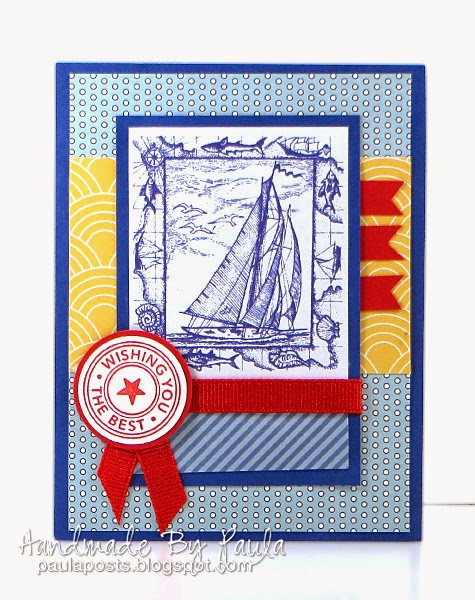
My approach is to typically start by finding the shape in the sketch that will be the focal point (it's usually pretty obvious) and find an image or stamp or sentiment that will fit it nicely. Once an image or sentiment is chosen the process tends to guide itself to some extent. For instance on this card, once I decided to use this sailboat image a nautical color scheme seemed like a good way to go. The yellow paper has a wave like pattern and the tiny dots on the blue pattern reminded me of water bubbles.
 |
Stamps by Stampin Up - Retired |
I've had this stamp for a long time. I am always tempted to color it and even though I'd consider myself intermediately skilled where coloring is concerned it's always a struggle and I never get an acceptable result on the first try. I really liked how this turned out and I think I've finally convinced myself that sometimes the BEST thing you can do if a stamp is detailed is to just stamp it well and let it stand on it's own.
Happy Crafting!


3 comments:
as far as I'm concerned it is perfect just like it is...you are correct. I too struggle to color, I usually find myself using colored digis instead. :)
Absolutely beautiful, Paula. I love the stamping in blue-reminds me of ocean spray.
Love your red accents carried through the focal point. You're right, it didn't need coloring!
Post a Comment